Many of us have been spending a LOT of time in our homes over the past two years and as a result we’ve become very intimate with our surroundings. We’ve also had plenty of time to while away the hours scrolling through social media feeds as well as plenty of time to miss all of the bouji hotels we used to be able to visit.
With inspiration in abundance and (due to the not being able to travel during a pandemic) a slightly bolstered bank balance, many of us turned our attention to improvements closer to home – and we have been no different. Our project was to create the small bathroom mash-up of elegant japanese minimalism and rustic scandinavian simplicity.
When the opportunity arose to take on a renovation project (with little else to stop us) we jumped right in. Our inspiration comes from many places; mainly the aforementioned social media scrolling (we are now following brands that include the sales of sexy light switches – yes they do exist – to Instagrammers who seem to repaint their living room once a week) and, of course every tradesman’s worst nightmare; the Pinterest board.
Our challenge was not so much big in size (a two bedroom first floor flat) as it was taking a 1960s built property and bringing it screaming into the 21st Century. It was a flat that had been loved and well looked after but just not in the ways that fitted with our taste.
Two rooms or one?
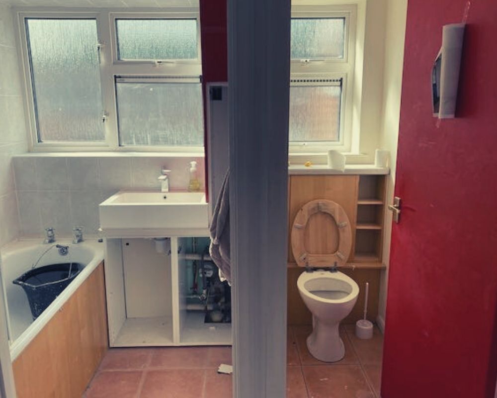
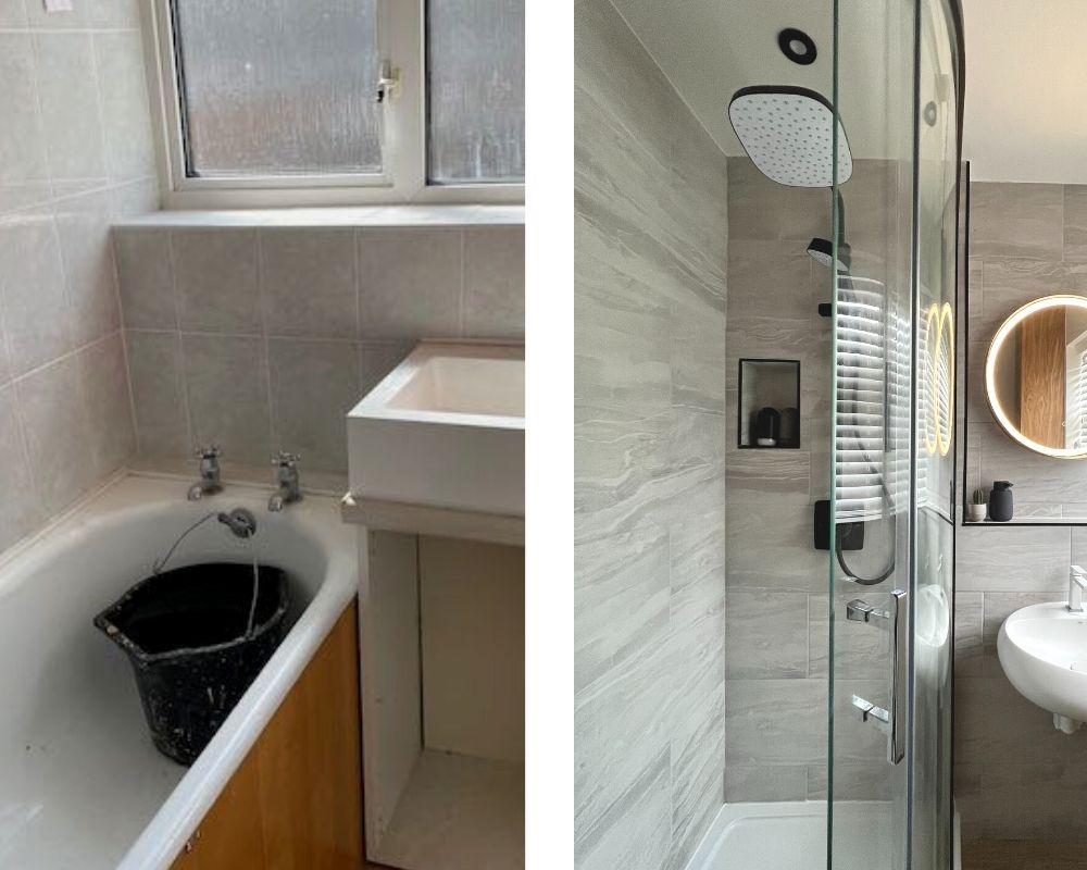
The flat was built with a separate toilet and bathroom and a (non-load bearing) wall separating the two. This made for two very small dark spaces – especially the toilet which felt claustrophobic. The bathroom contains a large waste pipe (unable to be moved), an uneven floor and a short cast iron bath (and yes, they are incredibly heavy).
The first job was to work out what to do with the two spaces: the only solution we felt was to knock the wall out and make it into one room hopefully letting in more light and giving it the sense of a much larger space. The wall had felt overbearing in the toilet closet but as soon as everything was stripped out and the room cleared of the existing bathroom furniture it was much easier to see what we were playing with space wise.
Making a plan?
We utilised a few different services to plan out the room to figure out if we could fit a regular sized bath, what size sink would work and whether we could reconfigure the space. We found it much easier to plan some aspects of the bathroom once things were moved but we still had to take in to consideration certain constraints: the toilet had to stay in pretty much the same place, as did the big ugly waste pipe. We could however move the sink and the taps and pipes so a bath or shower could work in a few configurations.
Our first go-to bathroom planner was Ikea (more about their Kitchen fitting experience in another post). While Ikea don’t sell everything you need for a bathroom (or fit them) you can use their online planner for a basic layout. We also had an online consultation with B&Q and an independent company.
B&Q were the most helpful and able to work with us in realtime to go through the process, change the sizes and add variations on shapes. We’d pretty much worked out by now that a bath was probably not the best option so we decided on a walk in shower, but what shape? Square, quadrant, rectangle, wet room, corner? What length and width? Even with a detailed plan it’s still hard (for novice renovators like us) to get a sense of the space and how you might feel in it. We did (when we were allowed) visit showrooms and stood in showers, moving around to make sure we had enough space.
We also used a very basic floor plan in actual size to map out the sizes of everything using newspaper. This was actually quite useful and did help us work out the size of the shower base.
Deciding on brands
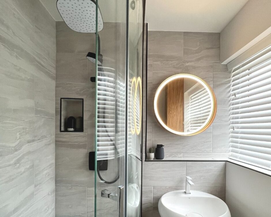
Once we’d settled on a size we had to work on the best style for our space? Looking online for reviews of quality and craftsmanship we decided on the Innov8 Curved Quadrant from Roman (prices from £1281). A solidly built glass curved unit with black edging that we chose alongside a ceramic base. The 800 x 1200 surround was a great choice for our small space and gives plenty of room.
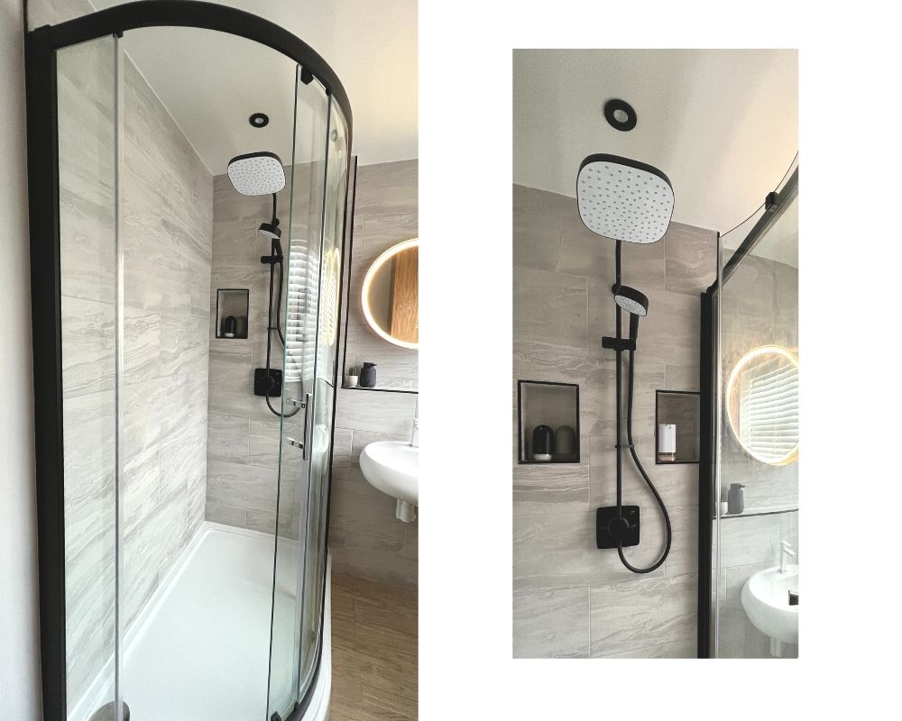
We decided to have light grey ceramic tiles with very light marble detailing for our walls and had two niches built into the same wall as our Mira Opero thermostatic mixer shower. We chose to buy this in black to go perfectly with the Roman surround.
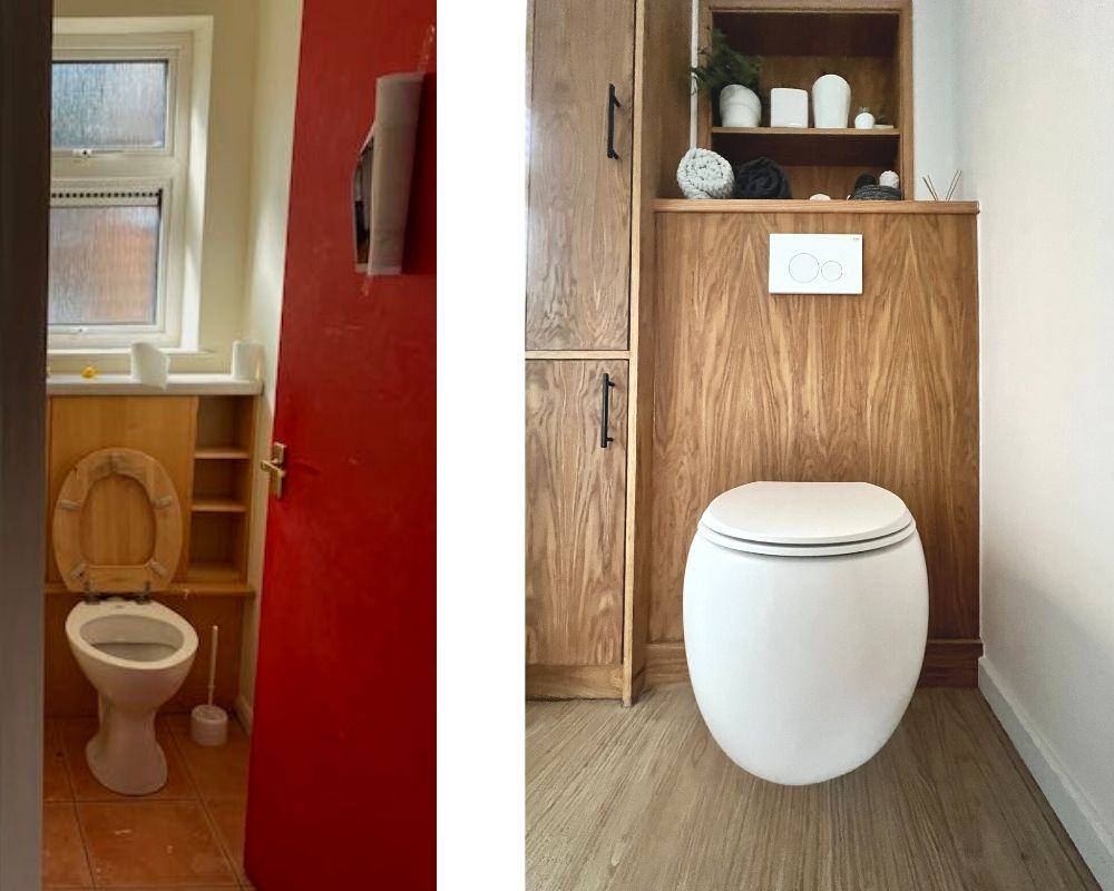
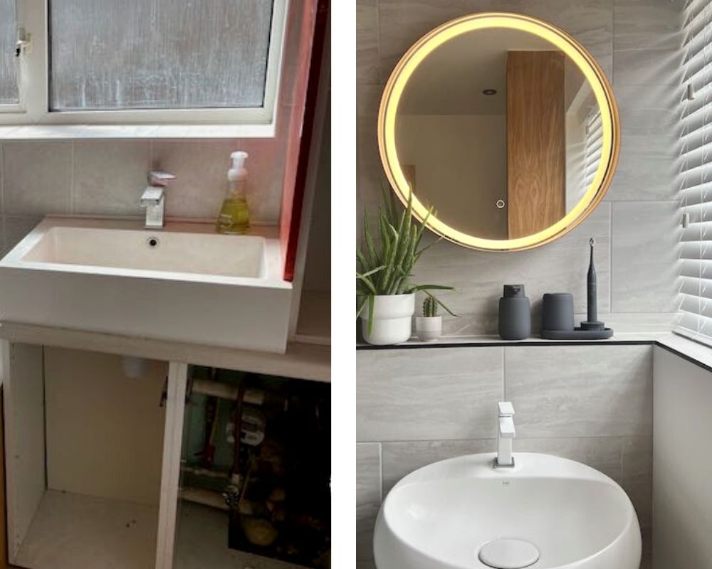
So once we’d become experts on shower surrounds it was then time to choose the toilet basin and sink. We looked at Vitra, Villeroy&Boch, and the Bauhaus range by Crosswater but non were quite as curvy and sexy as the RAK Cloud range designed as a collaboration Italian designer Giuseppe Maurizio Scutellà. The matt white wall hung toilet and sink keep our small room looking just that little bit larger thanks to the hidden hang systems.
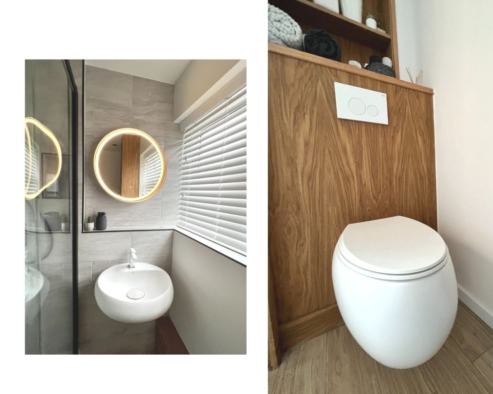
We used a mix of light colours (the RAK Matt white set looks timeless, chic and bright), kept the floor a light oak wood effect (although we used ceramic tiles to keep moisture at bay), added white slated venetian blinds in the window and a circular curved mirror that lights up, alongside bright white walls. The RAK sink and toilet certainly add a chic and stylish edge and help create a spa-like bathroom feel.
Finishing touches
We lifted the colour accents around the room from the Roman Innov8 curved quadrant by adding black edging to the tiles, the door frame and choosing (because we couldn’t help ourselves) the towel heater from Crosswater’s Bauhaus range. We also added 4 black spots on the ceiling just to tie it altogether.
Finally, we finished the toilet surround (hiding the fittings) with oak, as well as covering the waste and water pipes. We were able to add shelving to these for toiletries and of course a bit of greenery, creating a sense of natural calm within the space.
Style influences
Using influences from the concept of Japandi, a fusion of traditional Japanese minimalism, and rustic Scandinavian warmth, we wanted the bathroom space to embrace elements of the Scandinavian concept of ‘Hygge’ (the feeling of cosiness and comfort that brings contentment and well-being and blends it with the Japanese notion of ‘Wabi-Sabi’ – appreciating the beauty found in imperfection). Whilst both interior trends share a similar feel, when married together, they create a striking aesthetic.
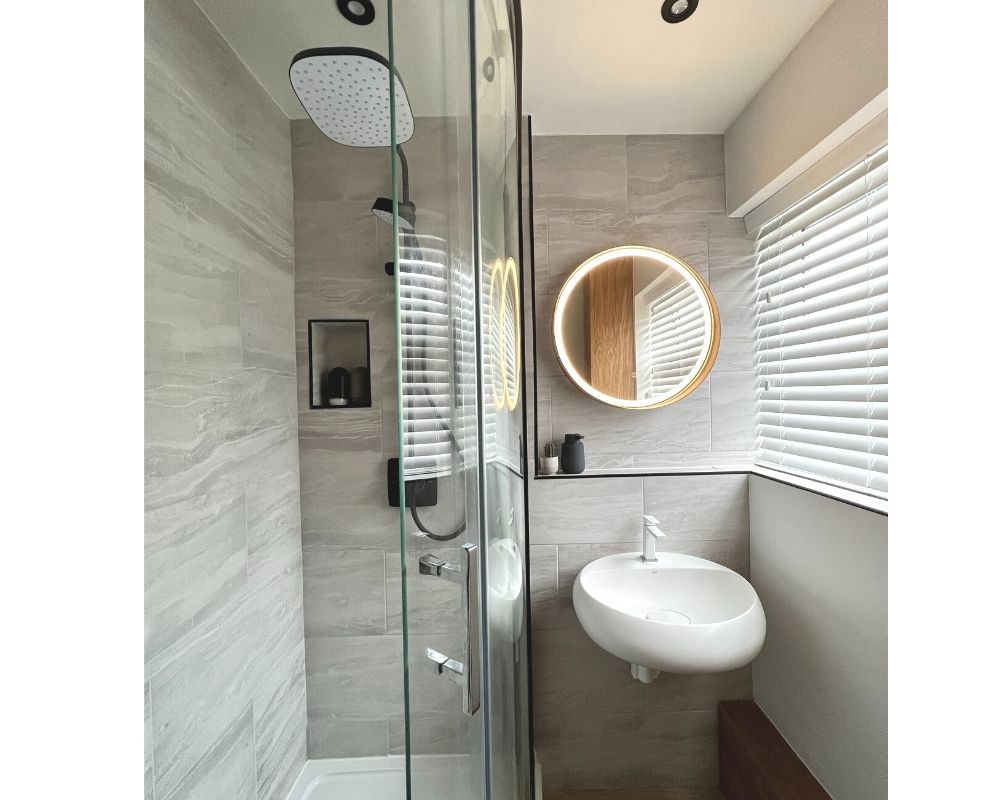
It’s not everyone that can say the bathroom is one of their favourite rooms in the home but when you’ve gone from dark and dingy to light and bright the benefits are extraordinary whist also managing to create space, style and peace in equal measures.
With natural wood textures, neutral tones and clean lines, the Japandi style lends itself perfectly to the bathroom and is both functional and aesthetically pleasing, creating the perfect backdrop for those (tastily censored) Instagram shower shots.
As the Japandi trend has its roots in minimalism, it was also time to banish the clutter, stashing all toiletries away in the custom built unit (which also hid that ugly soil pipe). Embracing the light, natural materials, the trend oozes tranquillity and is functional yet stylish, bringing a touch of Zen to our morning ritual.
We adore the less-is-more approach with uncluttered spaces and a calm, subdued, natural colour palette of light woods, black and off-whites creating our ideal small bathroom mash-up of elegant japanese minimalism and rustic scandinavian simplicity.
So save the avocado for your toast as opposed to the bathroom suite colour and you can’t go wrong.
The small bathroom mash-up of elegant japanese minimalism and rustic scandinavian simplicity: Approx total cost (with fitting) – £7000

